Pawsome
Seamless e-commerce checkout: Subscribe effortlessly to Nokia smart devices.
The application aims to enhance experience of user while finding partners for their cat to mate. It allows users to personalise their search setting to look for their specific demands, which could be age, sex of the cat, the cat’s breed or the location.It was the side project comes from the love for cats.
The challenges
Cat owners find it inefficient to look for mate partners for their cat online. They care about cat's information, i.e. breed, sex, age of mating, location, etc. However, these kind of information seems not to always available to check but they need to ask owner directly. Hence, sometimes it took long time and inefficient.
Goals
An application that allows cat owner to easily connect together with the main purpose of finding the suitable partner for the cat to be mated. Pawsome aims to streamline the process of finding mate partner with available needed information about cat and cat owner.

Understanding cat owners
In order to have more in depth insights about the problem, I conducted couples of interviews to understand the users' behaviours and features that needed to implement in the application.
Main findings: It took people long time to find the suitable mate partner for their cats due to long distance, whether the cats or owners are trustworthy enough to mate. Even if they were lucky enough to find the suitable partner for their cats, it was a long process to communicate for them to verify the cat's status and history.Owners expect cheaper price/ discounts to buy cat's supplies, at the pet shops.
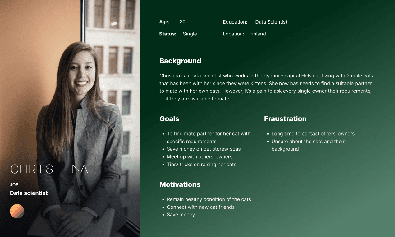
Get to know users and their feelings
A user personas was created to get more empathy with users.
This step is to ensure that main motivations, goals and frustrations of users are fully collected so as to be seen as the foundation for the development of system design.
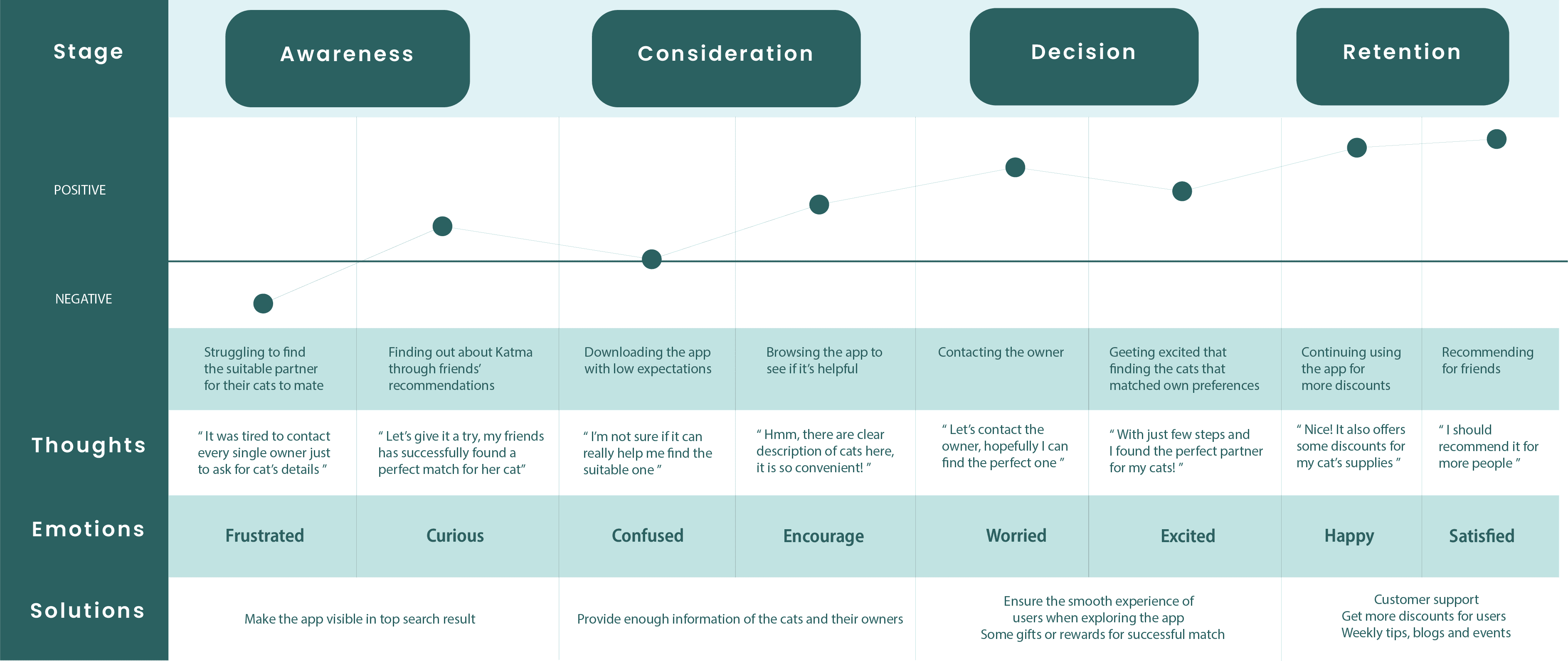
How’s user feeling?
Based on the user personas, I created a customer journey map.
It aims to clearly understand the user's thoughts and pain points through the experience of achieving their goals.
Exploring solutions
I created the initial sketches of the application to test with users whether the features are helpful and needed.
Proposed features were to:
Search for the suitable cat partner
Page for browsing blogs related to tips or tricks of training cats
Collect vouchers in spa, restaurants or pet supplies, etc.
Participate in local events

Final design
Some tests were done to find out that:
It was lack of cat's detailed information, which confuse participants about the cat's reliability.
Profile page should have more information about the cat as well as its owner (description of their breed, healthcare, certifications, etc.)
Below are main differences from current design in main component page, which have the updated in high-level navigation, visualization of components as well as structure of left-side navigation.
Home screen
After getting feedback, I updated Home Screen as a place for users to get access to local events as well as blogs page.
There will be various local events that users are allowed to participate in by just simply clicking on the participate button, or tab on it to see full information about the event. Events that users chose to participate in will be shown in their own profile page to be quickly managed.

Finding mate-partner screen
Partner screen is where users can browse and search for the suitable partner for their cat.
Or just simply browsing to follow their favourite cat to keep up to date with their activities. The location is set to user's present location, they can change and select their preferable location.The card information includes key information that cat owners typically look for, i.e. location; breed of the cat, sex, name and the picture of the cat.
🥸 I learnt that it was important to choose the suitable font size for this kind of application that have much information to show. Especially in the cat card, I wanted to show not only the name of the cat, but also its breed, location, sex as well as "follow" button. Hence, the font size needs to be adjusted that it is suitable for mobile environment and showing enough information.
👀 Could be better that the location is changed to kilometers, which shows how far the cat is from the user's location.

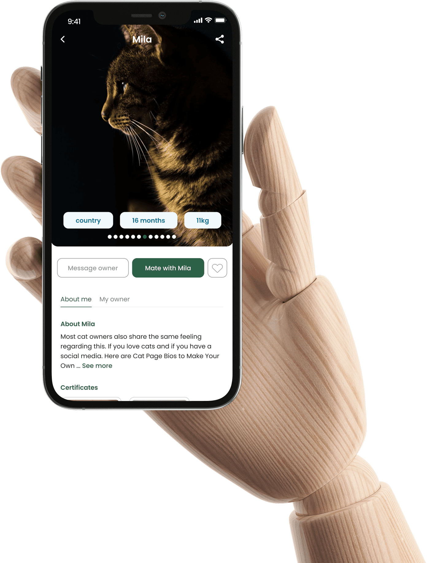
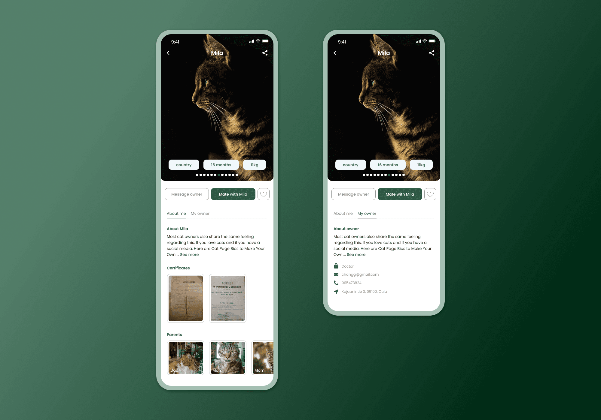
Cat profile screen
Taking into consideration the feedback from test participants, I updated the cat's profile to have more information of the cat and its certificates or owners for better reliability.
👻 Challenges:
It was not easy to structure the cat profile page as there was much information that needed to be included. I came up with the decision of having different UI elements for different kind of information, instead of showing them all as plain text.
Takeaways
As the project is still in the early stage, testing with users helped revealing various opportunities for improving in order to meet users' demands. I tested with 5 fellow students who also own at least one cat with multiple rounds from paper prototype to interactive prototype in order to provide seamless experience, several iterative processes are needed.
Connect
I'm now available to work. Let's collaborate and bring your vision to life!
Pawsome
Seamless e-commerce checkout: Subscribe effortlessly to Nokia smart devices.
The application aims to enhance experience of user while finding partners for their cat to mate. It allows users to personalise their search setting to look for their specific demands, which could be age, sex of the cat, the cat’s breed or the location.It was the side project comes from the love for cats.
The challenges
Cat owners find it inefficient to look for mate partners for their cat online. They care about cat's information, i.e. breed, sex, age of mating, location, etc. However, these kind of information seems not to always available to check but they need to ask owner directly. Hence, sometimes it took long time and inefficient.
Goals
An application that allows cat owner to easily connect together with the main purpose of finding the suitable partner for the cat to be mated. Pawsome aims to streamline the process of finding mate partner with available needed information about cat and cat owner.
Understanding cat owners
In order to have more in depth insights about the problem, I conducted couples of interviews to understand the users' behaviours and features that needed to implement in the application.
Main findings: It took people long time to find the suitable mate partner for their cats due to long distance, whether the cats or owners are trustworthy enough to mate. Even if they were lucky enough to find the suitable partner for their cats, it was a long process to communicate for them to verify the cat's status and history.Owners expect cheaper price/ discounts to buy cat's supplies, at the pet shops.
Get to know users and their feelings
A user personas was created to get more empathy with users.
This step is to ensure that main motivations, goals and frustrations of users are fully collected so as to be seen as the foundation for the development of system design.
How’s user feeling?
Based on the user personas, I created a customer journey map.
It aims to clearly understand the user's thoughts and pain points through the experience of achieving their goals.
Exploring solutions
I created the initial sketches of the application to test with users whether the features are helpful and needed.
Proposed features were to:
Search for the suitable cat partner
Page for browsing blogs related to tips or tricks of training cats
Collect vouchers in spa, restaurants or pet supplies, etc.
Participate in local events
Final design
Some tests were done to find out that:
It was lack of cat's detailed information, which confuse participants about the cat's reliability.
Profile page should have more information about the cat as well as its owner (description of their breed, healthcare, certifications, etc.)
Below are main differences from current design in main component page, which have the updated in high-level navigation, visualization of components as well as structure of left-side navigation.
Home screen
After getting feedback, I updated Home Screen as a place for users to get access to local events as well as blogs page.
There will be various local events that users are allowed to participate in by just simply clicking on the participate button, or tab on it to see full information about the event. Events that users chose to participate in will be shown in their own profile page to be quickly managed.
Finding mate-partner screen
Partner screen is where users can browse and search for the suitable partner for their cat.
Or just simply browsing to follow their favourite cat to keep up to date with their activities. The location is set to user's present location, they can change and select their preferable location.The card information includes key information that cat owners typically look for, i.e. location; breed of the cat, sex, name and the picture of the cat.
🥸 I learnt that it was important to choose the suitable font size for this kind of application that have much information to show. Especially in the cat card, I wanted to show not only the name of the cat, but also its breed, location, sex as well as "follow" button. Hence, the font size needs to be adjusted that it is suitable for mobile environment and showing enough information.
👀 Could be better that the location is changed to kilometers, which shows how far the cat is from the user's location.
Cat profile screen
Taking into consideration the feedback from test participants, I updated the cat's profile to have more information of the cat and its certificates or owners for better reliability.
👻 Challenges:
It was not easy to structure the cat profile page as there was much information that needed to be included. I came up with the decision of having different UI elements for different kind of information, instead of showing them all as plain text.
Takeaways
As the project is still in the early stage, testing with users helped revealing various opportunities for improving in order to meet users' demands. I tested with 5 fellow students who also own at least one cat with multiple rounds from paper prototype to interactive prototype in order to provide seamless experience, several iterative processes are needed.
Connect
I'm now available to work. Let's collaborate and bring your vision to life!