Vaisala
Enhancing Vaisala's Design System documentation website: How might we optimize the use of internal design system?
Vaisala Oyj is a Finnish company specializing in developing and manufacturing measurement and observation equipment for weather, environmental, and industrial applications. To support its product development, the company has implemented an internal design system called Rockhopper. It enables its designers and engineers to collaborate more effectively throughout the design process, from ideation to prototyping and testing.
The challenges
Developers and designers take long time to find component in the current documentation website to do their work. They already gave complaints but the design system team did not have enough resources to update and maintain the documentation website. The situation in long term will affect the productivity as well as their collaboration.
Goals
The project aims to optimize experience of relevant users toward the design system ‘s documentation website. Redesigning the visual style of Vaisala’s development and design system (which names Rockhopper) documentation website.

User research
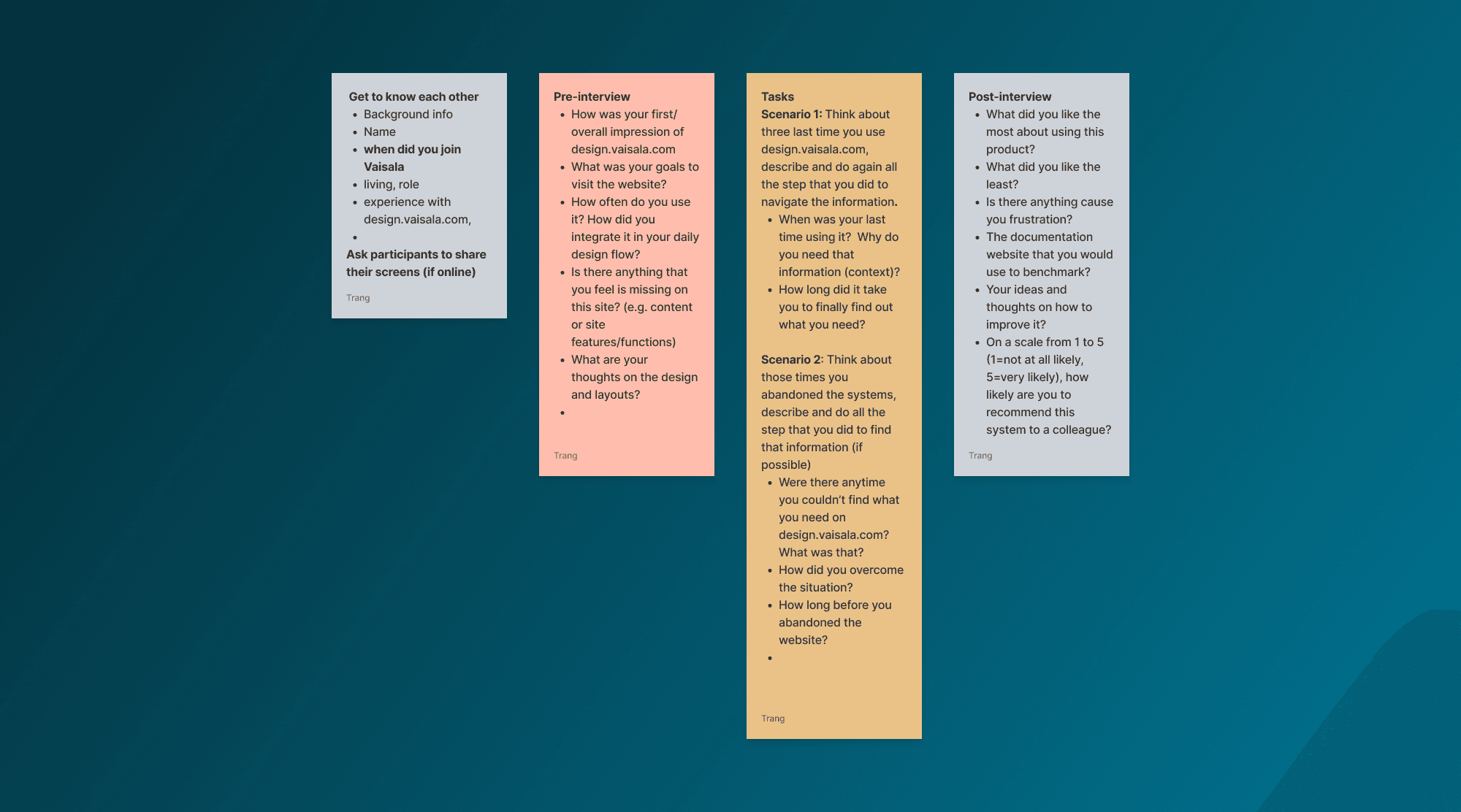
I did interviews to understand and share user pain points, regarding how they utilise the design system's website as well as finding main user’s frustration and goals.
I conducted discovery interviews with 30 stakeholders, includes designers, developers, tester and product owners across different functional teams. Questions were planned as to understand:
User daily works
How they use the website
How the website impacts their work and collaboration with others.
I gave them some tasks to remind them of their experiences with the website and observe how they navigate between each categorise to achieve their goals.
Most of the interviews were conducted online, due to the restriction of number of employees at the office. The interview were moderated with tasks and following questions to empathise with users behaviours and decisions in the website
Benchmarking
In order to support the design decision, I did secondary research to benchmark other design systems
It was to learn what others have been doing and what could be applied to design the prototype. The benchmark includes design system’s documentation website of large global organisations, as well as Finnish companies which are publicly publishing their design system.
I benchmarked design systems based on three themes
visual style
content
structure of the documentation website.
Besides, I was in charge of having a design system benchmark workshop. The idea of the workshop was to introduce other UX designers in the team with how other companies present and document their design system.

Affinity diagram
Then, I used affinity diagram technique to categorise findings into different themes so that it will be used later for deciding what needs to be improved in the documentation website.

Iterated designs
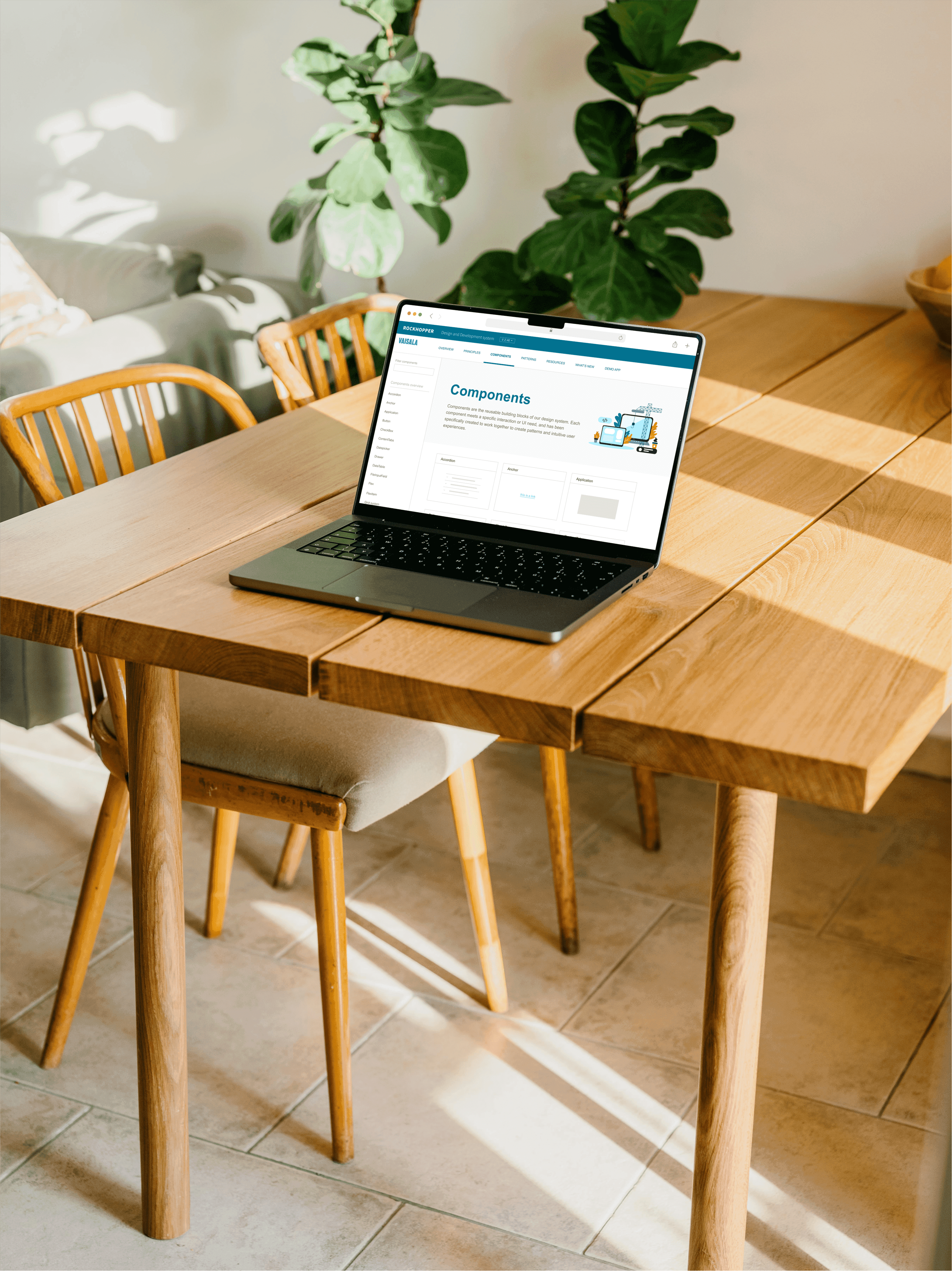
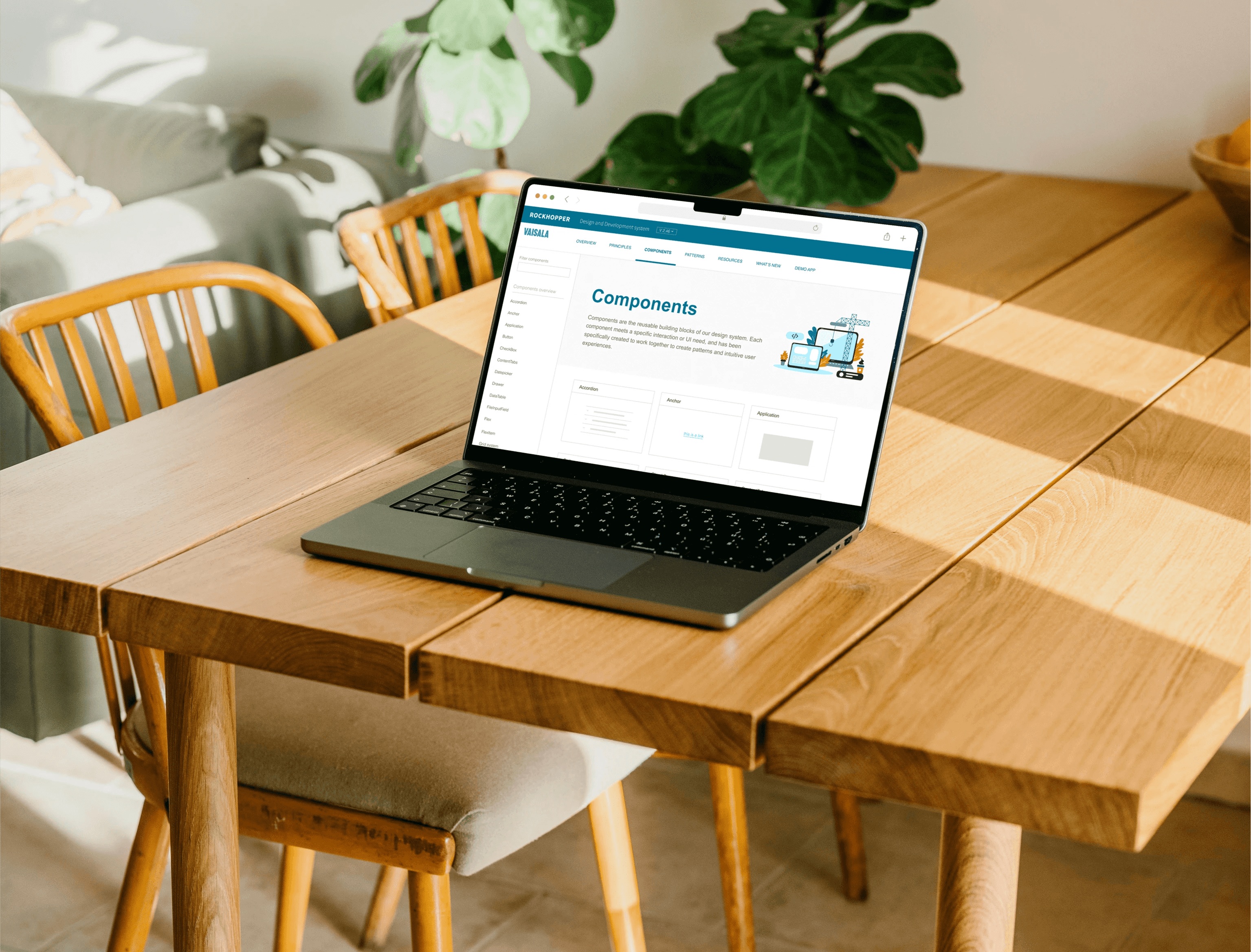
Based on finding insights, I redesigned main component page: high-level navigation, visualization of components as well as structure of left-side navigation.
65% of interviewees responded that the blank component page confused them when clicking on it. It should be the page that includes all the existed components of the company, with visualization that help them easier to find their desired component.
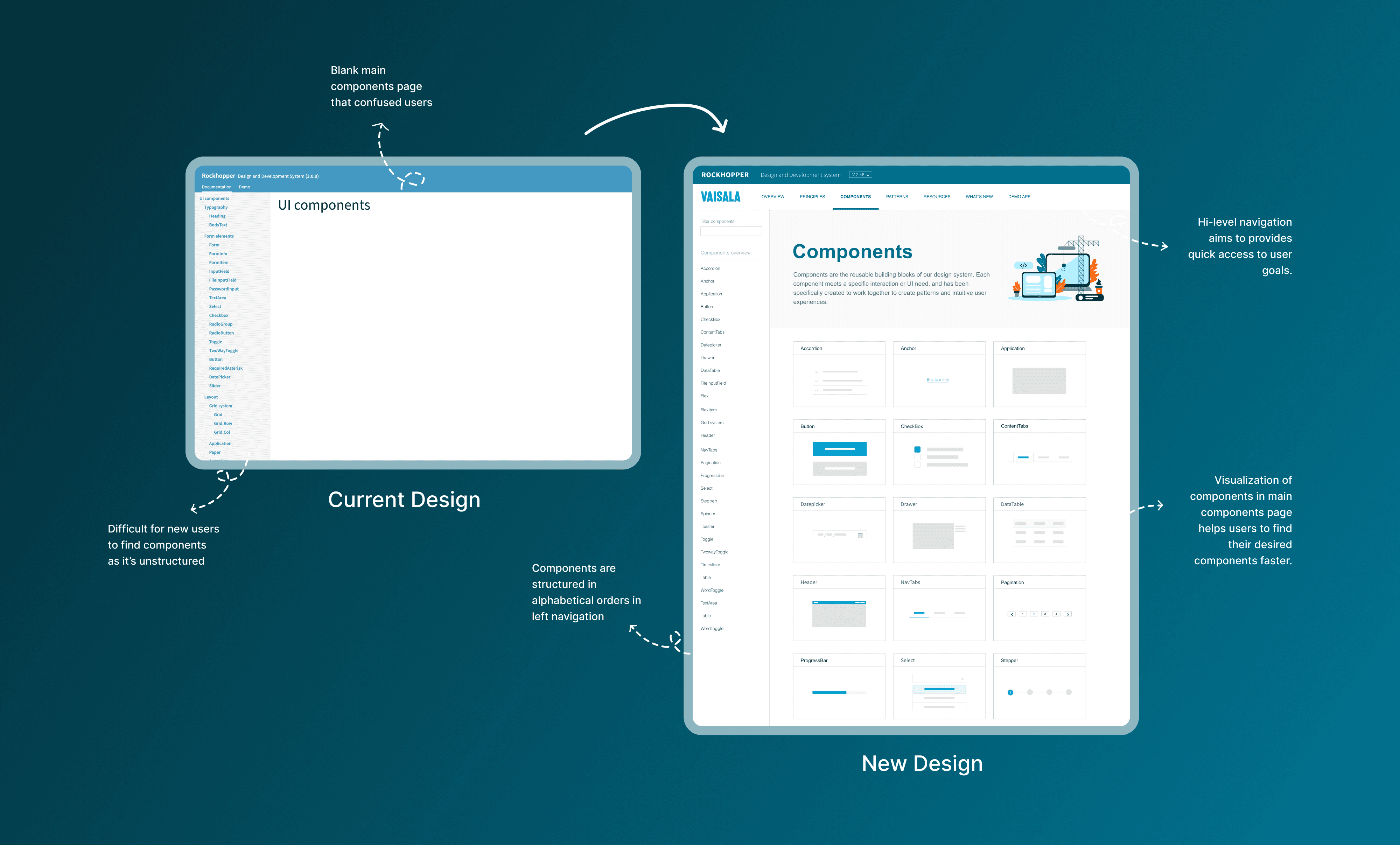
Component page
The examples of each component are unstructured leads to user confusion and doubt.
The Rockhopper design and development system has a wide range of examples for each component, which makes 68% of interviewees happy as they have appropriate resources to do their work.
However, the examples are unstructured and are placed randomly.
Hence, most of the interviewees responded that they felt like it was still in construction and doubted whether the components were up to date.

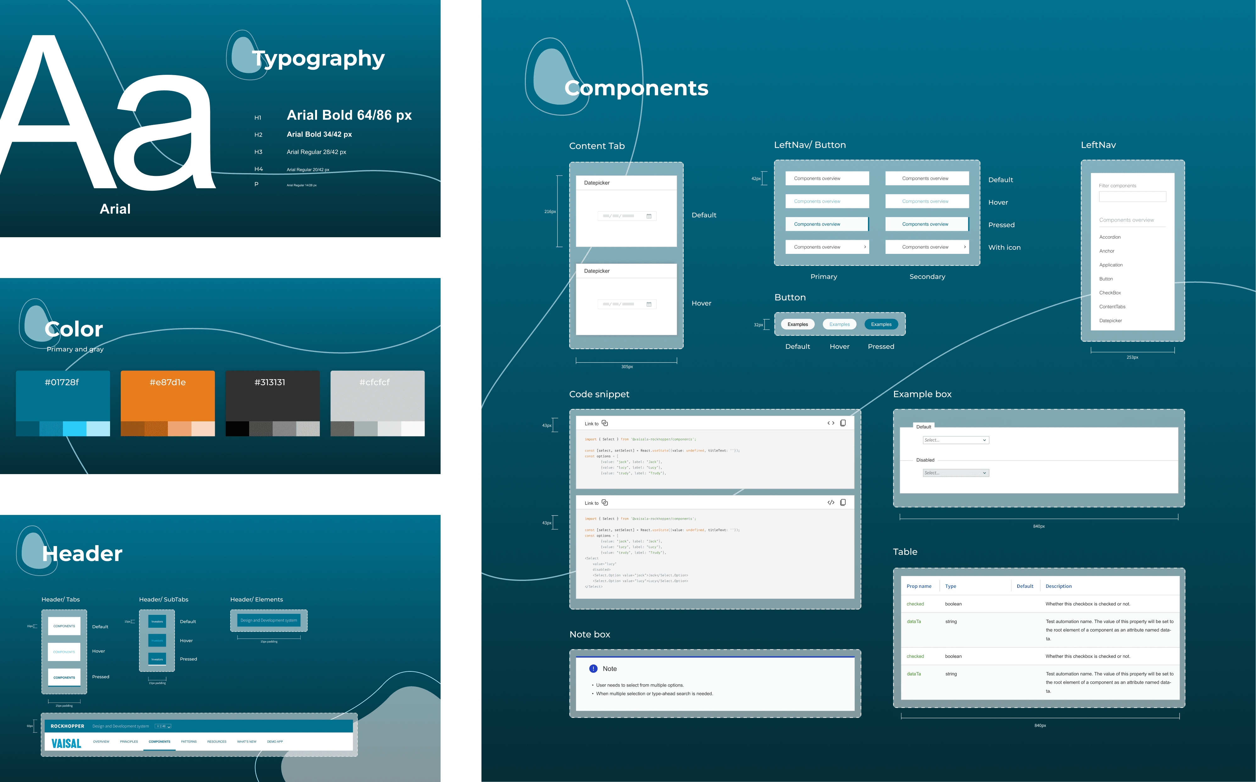
Design systems
I built a small design system for the project so that it will be used to maintain and update the website later.
The design system helps the designers and developers to collaborate more efficient and brings consistency to company digital products.